wasted potential

Spray away from face

SOLVED: IntelliJ IDEA LESS compiler failure

intellij Idea less compiler failI use IntelliJ IDEA for all of my web development work – it’s simply the best web IDE on the market, but I ran into a weird problem with the built-in LESS compiler recently. I cloned a project from the Github repo and set it up in IntelliJ. Everything was going well until I tried to compile the LESS files. I was getting weird errors whenever I tried to compile any LESS files in the project. Errors like this:

LESS CSS Compiler Error
mobile.less: Name Error: variable @screen-sm-max is undefined (line 2, column 20) near @media (max-width: @screen-sm-max) {

(This is weird because this variable is defined correctly)

or this:

LESS CSS Compiler Error
styles.less: org.mozilla.javascript.UniqueTag@15923b2d: NOT_FOUND Error: java.io.IOException: No such file file:/Users/admin/Desktop/_CLIENTS/Website%20build/BUILD/GIT/_WEB/styles/bootstrap/bootstrap.less (line -1, column -1)

(This is weird because it’s failing to compile Bootstrap, which I know is fine)

There was obviously something wrong with my setup because it worked fine for other developers. I was getting these errors when I used the “Compile to CSS” function or when I set up a LESS file watcher. I upgraded my LESS version. I spent a lot of time trying a lot of different things until I stumbled across this obscure thread.

That’s right. You can’t have any whitespace in the file path. My mistake was that the project was located in this folder:
Desktop/_CLIENTS/Website build/BUILD/GIT
Notice the space in “Website build.” I changed to folder name to “Website_build” and it worked. Note that manually adding “%20” into the file watcher path doesn’t work – you absolutely can NOT have any spaces in the path. I was kind of shocked at this problem. I thought we had gotten over this issue 20 years ago. Anyway, I’ve learned my lesson. No more folders with whitespace in the names. If this saves someone else a little time, then my wasted time will be worth something.

iOS: Limiting the character count on UITextField

For some reason, I couldn’t find this anywhere else on the web, so here it is. To set a maximum character count on a UITextField, simply implement this UITextFieldDelegate method:

-(BOOL) textField:(UITextField *)textField shouldChangeCharactersInRange:(NSRange)range replacementString:(NSString *)string {
    int maxLength = 64;
    //you only need this check if you have more than one textfield on the view:
    if (textField == self.nameTextField) {
        if (textField.text.length - range.length + string.length > maxLength) {
            if (string.length > 1) { // only show popup if cut-and-pasting:
                NSString *message = [NSString stringWithFormat:@"That name is too long. Keep it under %d characters.", maxLength];
                UIAlertView *alert = [[UIAlertView alloc] initWithTitle:@"Oops!"
                                                                message:message
                                                               delegate:nil
                                                      cancelButtonTitle:@"OK"
                                                      otherButtonTitles:nil];
                [alert show];
            }
            return NO;
        }
    }
    return YES;
}

Remember, this is a delegate method, so you have to specify that your UIViewController implements it:

@interface SomeViewController () <UITextFieldDelegate>

…and you have to set the delegate for the textfield:

self.nameTextField.delegate = self;

This can also be done for a UITextView with its delegate method:

-(BOOL) textView:(UITextField *)textView shouldChangeTextInRange:(NSRange)range replacementString:(NSString *)text {
    int maxLength = 64;
    //you only need this check if you have more than one textview on the view:
    if (textView == self.descriptionTextView) {
        if (textView.text.length - range.length + text.length > maxLength) {
            if (text.length > 1) { // only show popup if cut-and-pasting:
                NSString *message = [NSString stringWithFormat:@"That description is too long. Keep it under %d characters.", maxLength];
                UIAlertView *alert = [[UIAlertView alloc] initWithTitle:@"Oops!"
                                                                message:message
                                                               delegate:nil
                                                      cancelButtonTitle:@"OK"
                                                      otherButtonTitles:nil];
                [alert show];
            }
            return NO;
        }
    }
    return YES;
}

Game Design – Cards vs. dice vs. a spinner

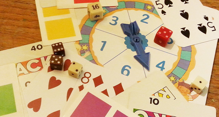
dice vs. spinner vs. cards
I just spent 14 hours driving back from my family’s beach vacation. While I was in the car, I was contemplating the design of a game that makes picking up toys more fun for my daughters. As I started fleshing out the idea, I was talking about it with Tonya (my wife). In my head, I had designed the game with cards, but she asked me if it could be a spinner or dice. My instant reaction was “well, of course not. It uses cards.” So, we started talking about why I prefer cards over dice or a spinner…

At first, it seemed like a simple internal prejudice I have. Spinners and dice are for baby games. Cards are for serious games. Obviously, this is a sweeping generalization and isn’t true in every case. Candyland uses cards. Role playing games often use dice. As we talked more, there were clearly deeper reasons for why I like card based games.

All three options provide a way to introduce some randomness into a game. Dice and spinners are basically interchangeable random number generators, but cards are not. Cards can be used the same way (a la Candyland), but they can also be used in much more complex ways. Think of all the games that can be played with a single deck of playing cards. It would be hard to come up with that many variations for a spinner or dice.

If I need a random number generator, I prefer dice over the spinner. There is something about the cheap cardboard spinners that are included in most games that feels unfair. If I roll a die 3 times in a row and get the same value on every roll, I think “Wow, that was weird.” But, if I spin a spinner 3 times in a row and always get the same results, I think “This cheap spinner sucks.” The spinner feels unfair. I don’t know if spinners really are unfair, but it’s never a good idea to design a game that feels unfair to players. As with all rules, there are exceptions: The Game of Life has a great spinner.

Speaking of game feel, cards feel more integral to the play (and in most cases they are). The dice and the spinner are both activities that essentially pause the gameplay in order to generate a random value. Because the dice and the spinner could easily be swapped with each other, or a digital random number generator, or some other device, they aren’t really integral to the game. In the case of card games, you generally aren’t pausing the gameplay to get a card. The cards are the gameplay. It’s a hard concept to describe, but cards make the gameplay more fluid, if used correctly.

I also think that the dice and the spinner are less satisfying because players are constantly being reminded of the concrete probability of getting a desired result. If a player rolls a single die, the probability of rolling a specific number is 1 in 6. If you have a spinner with 10 pie slices, your probability (theoretically) is 1 in 10. Players are subconsciously reminded of this every time they roll a die or spin a spinner. Cards abstract the probability…
candyland cards
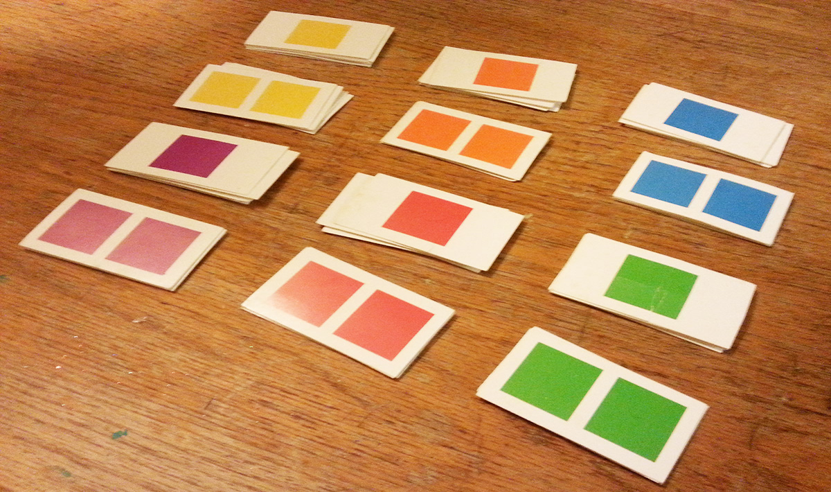
Going back to Candyland (probably the simplest use case for cards), there are 6 different colors. For each color, there are 6 single square cards and 4 double square cards. Ignoring the wildcards for the moment, what is the probability of drawing a double yellow? The math is not as simple as the 1 in 6 probability you get from a die. In a single turn, a player probably has a desired outcome in their head: they want to roll a three or draw an ace from the deck. The naked probability of dice and spinners is somehow more disappointing to players when they don’t get the desired outcome. Since cards hide their probability, a bad draw feels less disappointing and is just “the luck of the draw.”

Ultimately, I really want to use cards for my game design because I think they offer deeper gameplay possibilities. Additionally, I can easily throw out cards that aren’t working or add new ones to the deck as I refine my prototype. But it was interesting to think about why I prefer one basic game mechanic over another.

Image naming conventions for iOS and Android apps

Having a basic naming convention for the images in your mobile app can make your asset library a lot easier to manage. After working on some iOS and Android apps, I’ve come up with a method I think works pretty well. The basic rules are pretty simple:

  1. All image names should use only lowercase letters, numbers and underscores, like this:
    some_image_name.png
    another_one.png

    Do not use uppercase letters or special characters (Android doesn’t allow them anyway). The obvious exception here is that iOS retina display images will be have “@2x” appended to the name:

    basic_icon.png
    basic_icon@2x.png
  2. Do not put images in subfolders. If you use iOS xcasset libraries, use only ONE xcasset library for images. There are several reasons for this:
    • In Android, subfolders aren’t allowed for images
    • All of your images can be found in a single location, so nothing is hiding
    • It prevents accidentally giving the same name to 2 different images, which can cause all sorts of problems.
  3. Name all images by category like this:
    category_subcategory_imagename.png

    or you might think of it like this:

    folder_subfolder_imagename.png

    You still get the organization of folders without needing to use folders (which isn’t allowed in Android anyway). The other benefit is that images are grouped together alphabetically:

    home_header.png
    home_next_arrow.png
    home_prev_arrow.png
    login_label_user.png

    which is especially handy when using XCode’s Interface Builder for your layouts in iOS. The dropdown menu for images can get pretty long, so having them organized alphabetically by section makes it a lot easier to deal with.
    I tend to make the first word in the image name match the name of the app section (home, login). In cases where I need an image in multiple places, I create general category names like this:

    button_back.png
    button_next.png
    icon_check.png
    icon_trash.png

    Note that this also prevents creating multiple versions of the same basic icons. When I need an icon, it’s easy for me to see whether or not it already exists in the assets.

  4. Create a category for images that you want to delete later. I often use screenshots of design layouts to help me layout my views in Android Studio or XCode’s Interface Builder. I name them:
    comp_home.png
    comp_login.png
    comp_registration_1.png
    comp_registration_2.png

    Later, when I’m packaging my app for release, I know that I can trash anything in the “comp” category and it won’t break the app (well, it SHOULDN’T break the app).

  5. Give placeholder assets their proper, final names and correct dimensions (when possible), but make the image obviously wrong. Some people like to add red “FPO” lettering to these images. I personally like to add magenta backgrounds to image assets that I need to replace. Either way, it’s a glaring visual reminder that says “FIX ME PLEASE!!!” Giving a placeholder image the correct name and dimensions makes it easy to drop in a new file to replace the placeholder without combing through the files to rename or resize anything.

Of course, the key to this system is making sure that all of the other developers on the project are also using these rules. If everyone does it, managing your assets can be a lot less painful.

Page 4 of 18

Powered by WordPress & Theme by Anders Norén